Functionality of Course Signals
A review of the literature shows that many authors claim that this is possible. For example, Alshammari (2013) conducted a narrative review on educational data mining and its impact on learning outcomes. He concludes that educational data mining can:
a) classify students into groups according to their performance,
b) identify students who are likely to fail (and work on assistance plans),
c) be able to predict the future performance of students,
d) identify excellent performance traits and how these impact excellent learning outcomes,
e) identify tasks that estimate high performance and significant, effective engagement, and
f) improve teachers' performance.
Is learning analytics beneficial for learning, though? A further literature search shows that there are only a few studies that analyse the impact of learning analytics on learning outcome. Let us look at one of the first and most commonly referenced studies in this area:
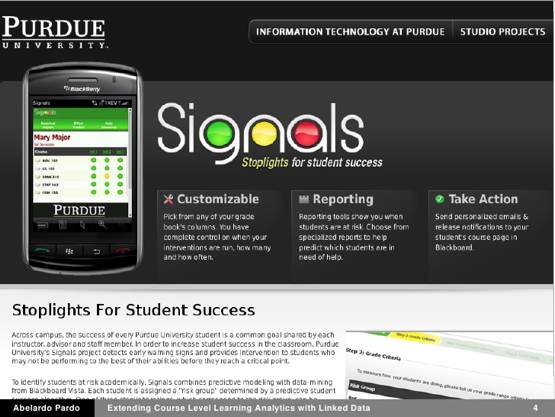
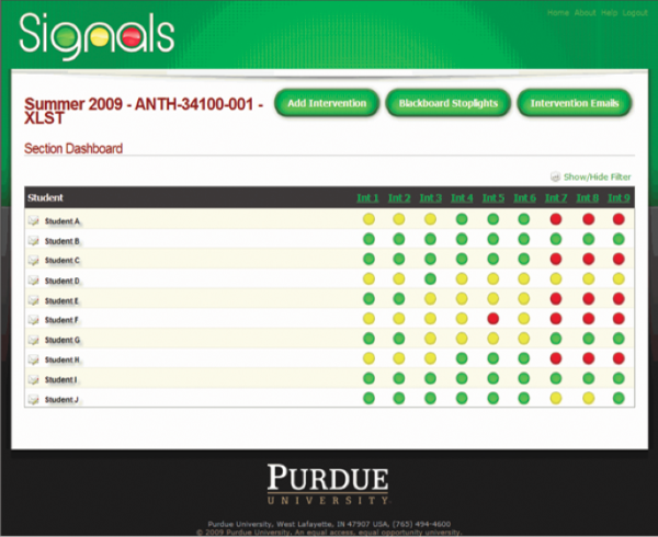
Arnold and Pistilli (2012) demonstrate an application of learning analytics to support early alerting and personalized learning support at Purdue University in Indiana by a system called “Course Signals”.
Course Signals is a student success system that allows faculty to provide feedback to student based on predictive models. The Course Signals system started around 2007 as one of the first learning analytics applications for personalized learning.
Within Course Signals, a (proprietary, unpublished) algorithm predicts students’ risk statuses. This algorithm is based on four components: performance, measured by percentage of points earned in course to date; effort, as defined by interaction with Blackboard Vista, Purdue’s LMS, as compared to students’ peers; prior academic history, including academic preparation, high school GPA, and standardized test scores; and, student characteristics, such as residency, age, or credits attempted.
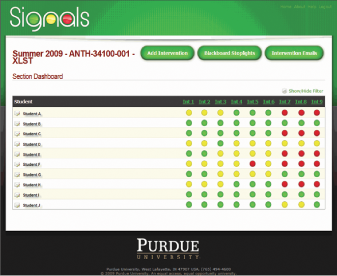
Based on results, a red, yellow or green signal is displayed on a student’s course homepage. A red light indicates a high likelihood of being unsuccessful in a given course; yellow indicates a potential problem of succeeding; and a green signal demonstrates a high likelihood of succeeding in the course. In case of a red light, the instructor communicates with the student to identify reasons of problems by either e-mail message, test message, referral to academic advisor or in facte-to-face meeting.
Source: https://image.slidesharecdn.com/abelardopardolaldapril2012-120429111139-phpapp02/95/extending-course-level-learning-analytics-with-linked-data-3-728.jpg?cb=1335698226
Source: http://www.purdue.edu/accreditation/2010/images/criterion/fig_3_6.png
The Course Signal system was tested in student cohorts between 2007 and 2009. Courses where the Course Signal system was used were compared to courses where it was not used. Evaluation showed that academic performance in CS courses around 10% higher, and student’s retention rate was 21% better. 89% of 1.500 surveyed students were positive about the CS system, and 74% felt motivated by the combination of a visual signal and instructor’s communication. At the time of publication (2012), the Course Signal system had been used by over 23.000 students at Purdue University.
While at a first glance these results seem promising, this evaluation study can be criticized. First, it is not further described how often and in which way the instructors reacted to the red lights. Second, statistical analysis did not take into account possible differences between students in Course Signal courses and the students in other courses. Third, Feldstein (2016) argues that the results may mostly be caused by selection bias and that the results were over interpreted by the university. No response of the authors or the Purdue university to this critic seems available. There are no more recent peer-reviewed publications on Course Signal available since 2012. Yet, the tool was in use until end of 2017. The Purdue website states: “Due to the vendor’s decision to decommission Course Signals, access to Course Signals at the university will no longer be available after December 16, 2017” (https://www.itap.purdue.edu/learning/tools/course-signals.html).
So, there seem to be no evidence on the impact of learning analytics. The Purdue study has too many limitations to allow meaningful conclusions. We know that learning analytics can identify students at risk. But learning analytics does not determine which intervention will then work best to help the student to get back on track. Further research is needed here.
Are you interested in implementing learning analytics in higher education? Have a listen to the below podcast from the University of Gloucestershire, and learn about their initial steps in getting started with learning analytics.

Since the late 1990s, dashboards have been developed to present results of learning analytics either to the teacher or to the student - or to both. These dashboards typically present extracts from the following information:
• Organizational information: deadlines for assignments, notifications by the teacher
• Student activity: time spent online, number of posts/twitter/blogs, also in comparison to the group, number of produced artefacts, number of read resources
• Student progress: student activity in relation to a predefined threshold (e.g. expected number of posts) or in relation to the group
• Social collaboration: Number of replies given, number of replies received, rating of replies
• Achievement of learning goals: Progress versus predefined goals is visualized; this progress can be documented either by self assessment, by teacher-based assessment or by formal assessments.
• Prediction of learning outcome: Based on algorithms, the expected learning outcome (fail/pass) is visualized
• Achieved learning outcome: points and grades achieved
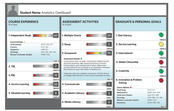
This dashboard presents the extent to which a student is achieving her goals for the course. These indicators are among others calculated based on self-assessments activities that are interweaved in online course material.
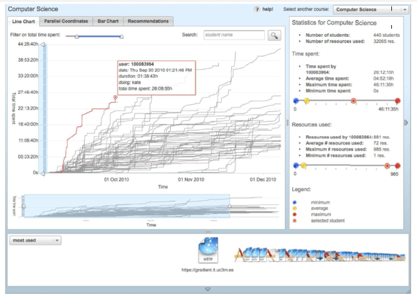
Provides visualizations of progress in the course for teachers and learners. The figure illustrates time spending of students (grey
lines) over the course period and further details such as minimum, maximum and average activity. Time spent and resource used are tracked from the learning management system.
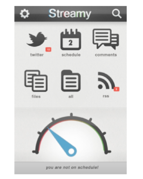
This shows the number of relevant course tweets, links to other relevant information, and a progress indicator that takes into account the time investment of the student, progress made in the course, the course schedule, etc.
This instructor dashboard predicts and visualizes learning outcomes based on three data sources: grades in the course so far, time on task and past performance.